library(tidyverse)
library(metafor)
library(readxl)

current_data <- read_excel("sample_data.xlsx", sheet = "farminc")

resoutcomesubcode <-
 rma(yi,
    vi,
    method="DL",
    data = current_data,
slab = authors)2 Meta-Analysis Model Fitting
The application’s Model Analysis tab offers comprehensive diagnostics for model fitting, including estimation and reliability assessment, risk of bias evaluation, outlier detection, and publication bias analysis. Given the direct impact of model fitting on the output, all relevant code is conveniently presented together for thorough examination and transparency.
2.1 Model Specification
The metafor package is utilized for conducting model fitting and diagnostics across datasets. This application employs a random-effects model, leveraging the DerSimonian-Laird estimator for variance estimation, as outlined by DerSimonian & Laird (1986) and further discussed by Raudenbush (2009).
method="DL"means DerSimonian-Laird estimator. See other options.slab = authorsdefines the label as authors
2.2 Model Diagnosis
This section offers a diagnostic overview, derived from the metafor package’s reporter. It delivers detailed narrative insights that shed light on the performance and potential implications of the model. Additionally, an accompanying graph provides a visual representation of the estimates and their 95% confidence intervals, aiding in the interpretation of the model’s efficacy and the reliability of the findings.
2.3 Outlier analysis
The metafor package is instrumental in identifying and visualizing outliers within your dataset, focusing on two pivotal metrics: Cook’s Distance and Studentized Residuals. Be noted that metafor package provides six different ways to detect outliers and implement the whole anaylsis using influence function. Here’s how to interpret the results from these analyses:
The metafor package plays a crucial role in identifying and visualizing outliers in your dataset, focusing on two key metrics: Cook’s Distance and Studentized Residuals. (It is important to note that the metafor package offers six distinct methods for outlier detection and conducts comprehensive analysis using influence function.) Here’s how to interpret the outcomes of these analyses:
2.3.1 Cook`s Distance for Each Study
Purpose: Cook’s Distance is a measure used to estimate the influence of each data point (or study, in this context) on the fitted values of the model. It helps identify outliers that might disproportionately affect the model’s predictions.
Interpretation:
The plot is generated showing the Cook’s Distance for each study.
Points above a certain threshold, calculated as the median of Cook’s distances plus six times the interquartile range (IQR), are considered potential outliers.
The dashed line on the plot indicates this threshold.
Studies with Cook’s Distance above this threshold are marked and considered “Above Threshold,” suggesting they have a significant influence on the model and may need further examination.
data_influence <- resoutcomesubcode |>
  influence()

result_tibble <- data_influence %>%
  pluck("inf") %>%
  as_tibble(rownames = "authors") %>%
  bind_cols(is_infl = data_influence %>% pluck("is.infl")) %>%
  mutate(row_id = row_number())

k <- nrow(result_tibble)
crit <- qnorm(0.05 / (2 * k), lower.tail = FALSE)
median_cooks <- median(result_tibble$cook.d)
iqr_cooks <- IQR(result_tibble$cook.d)
threshold <- median_cooks + 6 * iqr_cooks

plot <- result_tibble %>%
  ggplot(aes(x = row_id, y = cook.d)) +
  geom_point(aes(color = ifelse(cook.d > threshold, "Above Threshold", "Below Threshold")), size = 5) +
  geom_hline(yintercept = threshold, linetype="dashed", linewidth = 2) +
  geom_text(aes(x = nrow(result_tibble), y = threshold + 0.05, label = paste("Threshold: ", round(threshold, 3))),
            hjust = 1.5, vjust = 0.5) +
  geom_text(aes(label = authors), size = 4, hjust = 3, data = . %>% filter(abs(rstudent) > abs(crit))) +
  scale_x_continuous(breaks = seq(1, nrow(result_tibble), 1)) +
  scale_color_manual(values = c("Below Threshold" = "#B4D2EE", "Above Threshold" = "#C83737")) +
  labs(title = "Cook's Distance for Each Study",
       subtitle = "Dashed line represents the threshold using chi-square distribution",
       x = "",
       y = "Cook's Distance",
       color = "") +
  theme_minimal() +
  theme(legend.position = "top",
        plot.title = element_text(size = 15, hjust = .5),
        plot.subtitle = element_text(hjust = .5))

plot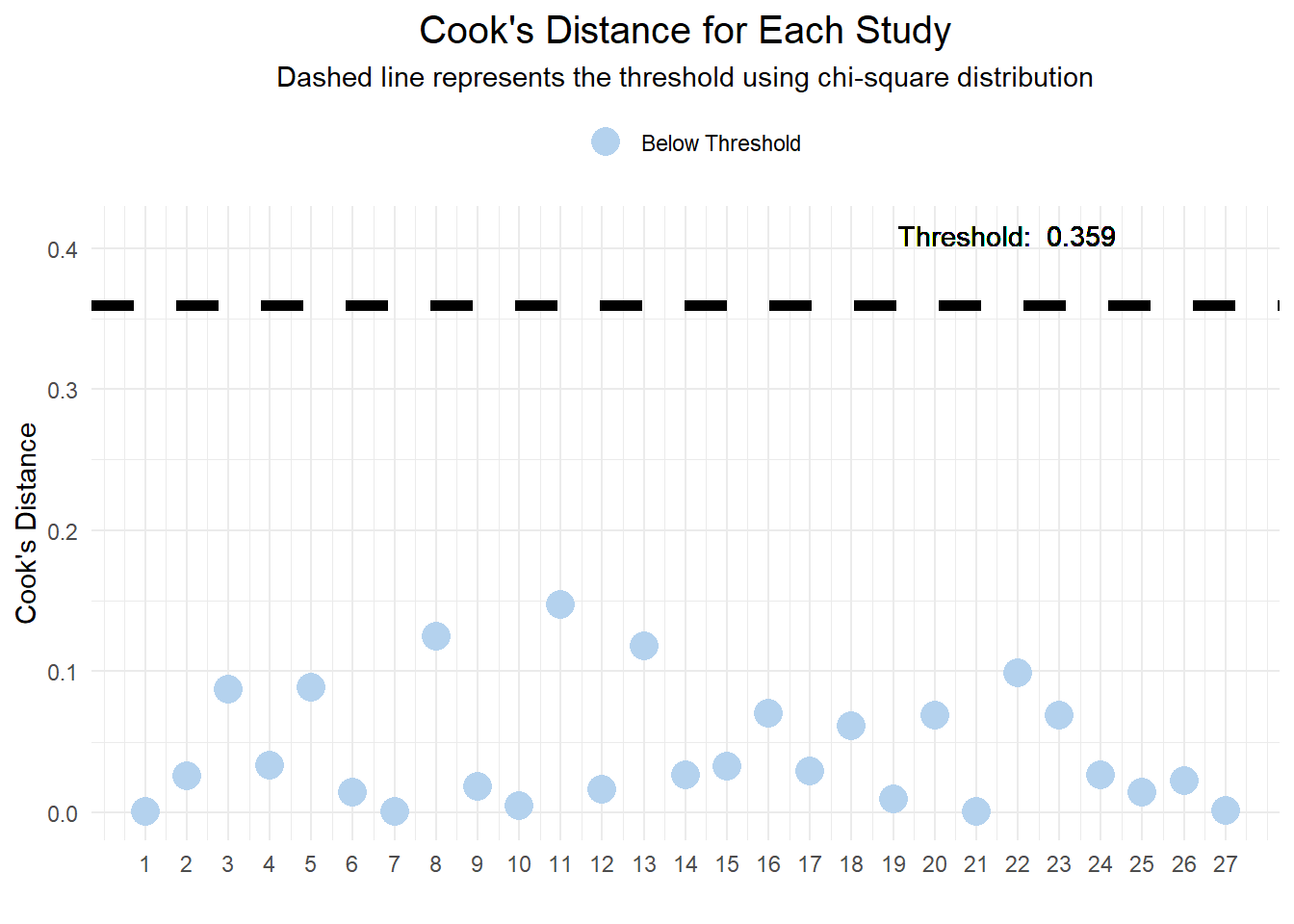
2.3.2 Studentized Residuals for Each Study
Purpose: Studentized Residuals are used to identify outliers in the dataset by comparing the standardized residual of each observation against a threshold. This metric is useful for detecting data points that deviate significantly from the predicted values.
Interpretation:
The plot displays the Studentized Residuals for each study.
The critical value for identifying outliers is determined by the normal distribution, adjusted for multiple comparisons.
Observations with absolute Studentized Residuals exceeding this critical value are considered potential outliers.
The plot includes dashed lines representing positive and negative thresholds.
Points falling outside these thresholds are labeled “Above Threshold” and warrant closer scrutiny for their impact on the model’s accuracy.
crit <- qnorm(0.05 / (2 * k), lower.tail = FALSE) # Outlier detection using normal distribution

plot <- result_tibble %>%
        ggplot(aes(x = row_id, y = rstudent)) +
        geom_point(aes(color = ifelse(abs(rstudent) > crit, "Above Threshold", "Below Threshold")), size = 5) +
        geom_hline(yintercept = c(crit, -crit), linetype="dashed", size = 2) +
        geom_text(aes(x = nrow(result_tibble), y = crit + 0.05,
                      label = paste("Threshold: ±", round(crit, 3))),
                  hjust = 1.5, vjust = 2) +
        geom_text(aes(label = authors), size = 4, hjust = 3, data = . %>% filter(abs(rstudent) > abs(crit))) +
        scale_x_continuous(breaks = seq(1, nrow(result_tibble), 1)) +
        scale_color_manual(values = c("Below Threshold" = "#B4D2EE", "Above Threshold" = "#C83737")) +
        labs(title = "Studentized Residuals for Each Study",
             subtitle = "Dashed line represents the threshold using Cook's distance larger than the median plus six times the interquartile range of the Cook's distances",
             x = "",
             y = "Studentized Residuals",
             color = "") +
        theme_minimal() +
        theme(legend.position = "top",
              plot.title = element_text(size = 15, hjust = .5),
              plot.subtitle = element_text(hjust = .5))

plot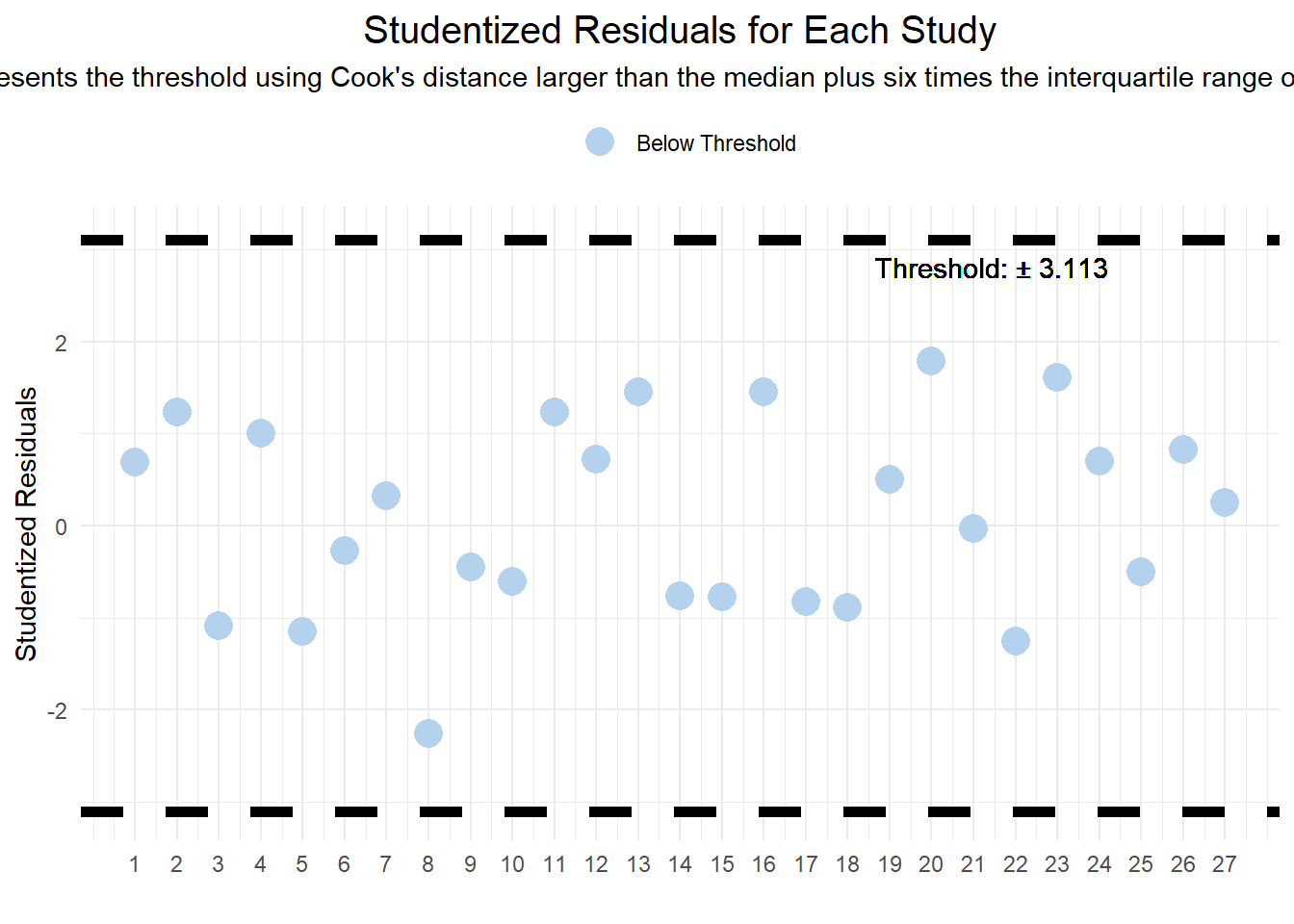
2.4 Publication Bias
2.4.1 Funnel Plot
The funnel function in metafor dynamically generates a funnel plot based on the meta-analysis results. A funnel plot is a scatter plot of study effect estimates against some measure of each study’s size or precision. It is used to visually assess publication bias or systematic heterogeneity. In the absence of bias, the plot resembles a symmetrical inverted funnel because larger studies (which appear towards the top of the plot) will cluster around the overall effect estimate, while smaller studies scatter more widely at the bottom. This visualization helps identify asymmetries that may indicate publication bias or other issues affecting the meta-analysis.
funnel(resoutcomesubcode)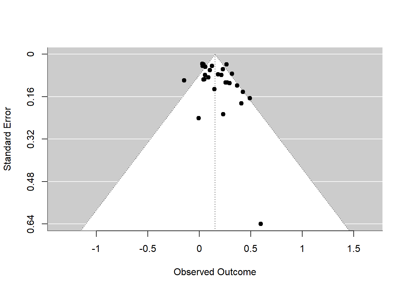
2.4.2 Trimfill Plot
The trim and fill analysis, represented by the trimfill plot, serves as a diagnostic tool to assess the potential presence of publication bias in a meta-analysis. Developed by Duval and Tweedie, this method detects asymmetry in the funnel plot, which may suggest missing studies—particularly those with non-significant or contrary results that haven’t been published. The technique estimates the number and outcomes of these absent studies to create a more balanced funnel plot. This adjusted plot then provides an alternative summary effect estimate, reflecting what the results might have been had the missing studies been included.
However, it’s crucial to understand that the trimfill plot does not offer a ‘corrected’ effect size but rather provides a way to gauge the robustness of the meta-analysis findings in the face of potential publication bias. It’s especially useful when employing equal- or random-effects models and should be regarded as part of a sensitivity analysis to evaluate the influence of publication bias on the meta-analysis conclusions. The empty points added to the plot represent the hypothesized locations of these missing studies, helping to visualize their potential effect on the research synthesis.
funnel(trimfill(resoutcomesubcode))
2.4.3 Statistical Test
The R code snippet is part of a Shiny application designed to perform a statistical analysis to detect publication bias in meta-analytic data. This analysis uses two key tests: the rank correlation test and the regression test, both of which assess funnel plot asymmetry—a common indicator of publication bias. Here’s a breakdown of the process and interpretation:
- Rank Correlation Test (
ranktest): This test examines the correlation between the effect sizes and their variances to detect asymmetry in the funnel plot. A significant result (p-value ≤ 0.05) suggests potential publication bias.
ranktest(resoutcomesubcode)
Rank Correlation Test for Funnel Plot Asymmetry

Kendall's tau = 0.2422, p = 0.0798- Regression Test (
regtest): This test also assesses funnel plot asymmetry by regressing the standardized effect estimates against their precision. Similar to the rank correlation test, a significant p-value indicates possible publication bias.
regtest(resoutcomesubcode)
Regression Test for Funnel Plot Asymmetry

Model:     mixed-effects meta-regression model
Predictor: standard error

Test for Funnel Plot Asymmetry: z = 2.1916, p = 0.0284
Limit Estimate (as sei -> 0):   b = 0.0596 (CI: -0.0342, 0.1535)
Comprehensive Evaluation: Integrating statistical evidence, this section delivers a understanding of the model’s robustness. It addresses the critical question of whether the meta-analysis findings might be skewed by unrepresented or overly influential studies.
No Asymmetry Detected: Both tests have p-values greater than 0.05.
Potential Asymmetry Detected: Both tests show significant results with p-values at or below 0.05, indicating possible publication bias.
Asymmetry Detected by One Test Only: One test is significant while the other is not, suggesting the need for careful interpretation of asymmetry detection.
2.5 Exporting Full Reports (Reporter Function)
To download the complete report generated by the reporter function in the metafor package, click the “Report from metafor” button located in the top right corner of the user interface.
2.6 Moderator Analysis
2.6.1 Moderator Analysis Specification
The Moderator tab facilitates moderator analysis using the rma function from the metafor package. The basic programming command is as follows:
rma(yi,
    vi,
    method="DL",
    mod = ~eval_design, # Specific moderator can be coded here
    data = current_data,
    slab = authors)
2.6.2 Diagnosis Plots
The type of diagnostic plot displayed depends on whether the selected moderator is continuous or discrete:
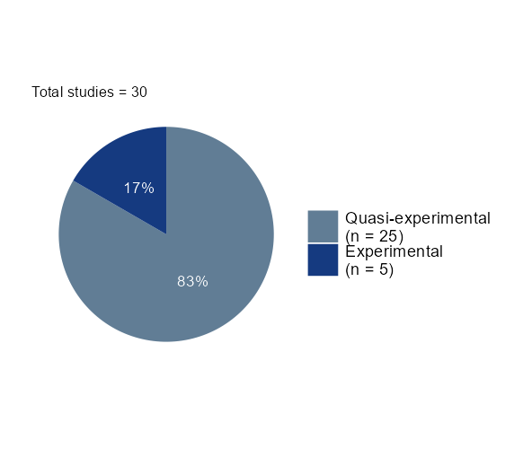
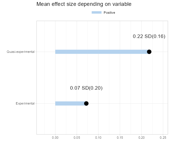
- For a discrete variable, a pie chart illustrating the distribution and an estimate plot will be shown. The right plot displays the average effect size for each category. When the selected moderator is the evaluation design, you must choose a reference category for the regression. By default, the application processes the first category as the reference, but you can manually select a different category.
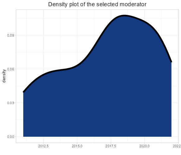
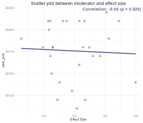
- For a continuous moderator, density and correlation plots are presented. The right plot enables the diagnosis of the correlation statistic and p-value, highlighting any correlation between the effect size and the selected value.
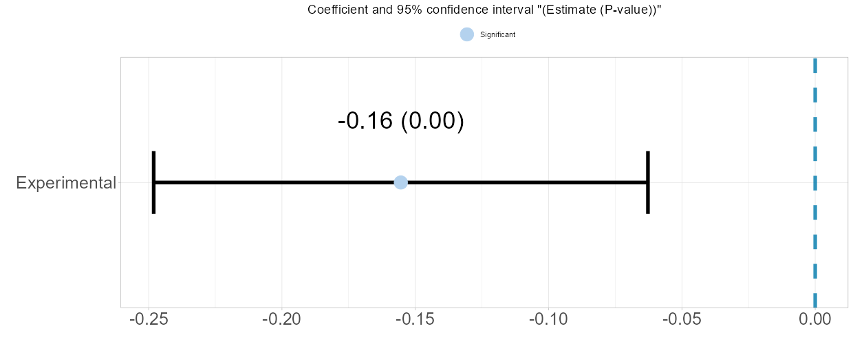
- The estimation plot visualizes the estimate alongside its p-value. The left and right bars represent the lower and upper confidence intervals, respectively. If this error bar includes 0, the estimation is deemed not statistically significant, as corroborated by the p-value.
2.6.3 Moderator Detector
By using Moderator Detector, the application conducts the same analysis for all variables, identifying those with statistically significant values at the 95% confidence level. This list of significant estimates aids in further analysis.
2.7 Takeaways
Model Fitting: Users can employ the
metaforpackage to fit meta-analysis models with robust variance estimation methods, including the DerSimonian-Laird estimator.Outlier Detection: Through Cook’s Distance and Studentized Residuals, users can identify and examine potential outliers affecting the model’s accuracy.
Publication Bias Assessment: The application allows for both visual (funnel and trimfill plots) and statistical (rank and regression tests) analyses to detect and adjust for publication bias.
Moderator Analysis: This feature allows examination of moderators’ impact on effect sizes, offering diagnostic plots for both continuous (density plots) and discrete (pie charts) variables. Users can manually select reference categories, aiding in uncovering patterns or biases in the data.